FOLLOWING THE BOOMERS
The US population is comprised of seven living generations: the Greatest Generation (born 1901–1927), the Silent Generation (1928–1945), Baby Boomers (1946–1964), Generation X (1965–1980), Millennials (1981–1995), Generation Z (1996–2010), and Generation Alpha (2011–2025). In this project, you will construct a series of stacked, side-by-side bar charts that demographers call an age pyramid and focus on how one of these generations affects the pyramid. This pyramid distribution for human population has been observed throughout the history of mankind but, since the 1950s, an interesting trend has developed. Our goal is to identify that trend and offer a reasonable explanation for its occurrence. In the table1 below, we have the distribution of the percentage of the US population by age groups for the years 1950, 1960, 1970, 1980, 1990, 2000, 2010, and 2020. The age groups are further broken down into sex as recorded at birth. The shaded cells roughly represent the portion of the population that was born between 1946 and 1964 (the Baby Boomers), with some overlap into the Silent Generation and Generation X.
| Age Group | 1950 | 1960 | 1970 | 1980 | ||||
|---|---|---|---|---|---|---|---|---|
| Male | Female | Male | Female | Male | Female | Male | Female | |
| – | ||||||||
| – | ||||||||
| – | ||||||||
| – | ||||||||
| – | ||||||||
| – | ||||||||
| – | ||||||||
| – | ||||||||
| Total % | ||||||||
| Age Group | 1990 | 2000 | 2010 | 2020 | ||||
|---|---|---|---|---|---|---|---|---|
| Male | Female | Male | Female | Male | Female | Male | Female | |
| – | ||||||||
| – | ||||||||
| – | ||||||||
| – | ||||||||
| – | ||||||||
| – | ||||||||
| – | ||||||||
| – | ||||||||
| Total % | ||||||||
1 Paul Taylor, "The Next America." Pew Research Center, Washington, D.C. (April 10, 2014) https://www.pewresearch.org/next-america/#Two-Dramas-in-Slow-Motion. Pew Research Center bears no responsibility for the analyses or interpretations of the data presented here. The opinions expressed herein, including any implications for policy, are those of the author and not of Pew Research Center.
-
For each year that is listed at the top of the table, construct a stacked, side-by-side bar chart by performing the following steps. (If time allows, construct your stacked, side-by-side bar charts on note cards. Be sure the horizontal axis stays the same for each graph. Stack the cards in order and flip through them to create an animated bar chart.)
-
Center the horizontal axis at and mark increments of to the left and to the right.
-
Beginning at the bottom of the chart with the 0–9 age group, extend a bar to the right of center indicating the appropriate percentage of the population that were female. Extend a bar to the left of center indicating the appropriate percentage of the population that were male.
-
Continue this process for each age group, stacking the bars on top of one another and shading the Baby Boomer bars a different color than the other bars. It should look similar to the following stacked, side-by-side bar chart. (The following chart is a visual aid only. Notice that the percentages and age groups are different than those given in the table.)
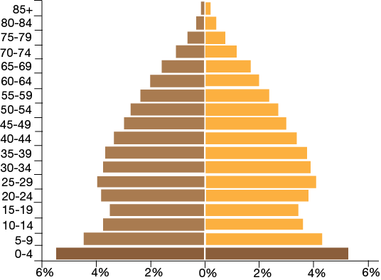
A side-by-side bar chart. The middle of the x-axis is labeled 0% and extends both left and right to 6% by 2%. The left of the center of the chart depicts a bar chart of one data set. The right of the center of the chart depicts a differently colored bar chart of a different data set.
-
-
Compare the eight stacked, side-by-side bar charts. How does the shape of the age distribution change over time? What factors might be contributing to this changing shape?
-
What would you predict the stacked, side-by-side bar charts to look like in 2030, 2040, and 2050?
-
What additional information is gained by separating the population into sex?