Telling a Story with Data
As you have learned throughout this chapter, data can be acquired in a variety of ways and then cleaned up, analyzed, and used to tell a story. Whether the story told about the data is true or is strongly backed by the data is something that should always be considered. While visualizations of data can help simplify the story that is being told, these visualizations can often be misleading. Consider the following data set, which shows the youth literacy rate, poverty level, access to electricity, birthrate, and mobile cellular subscriptions worldwide over a -year span.
| Year | Youth Literacy Rate () |
Poverty Level () | Access to Electricity () |
Birthrate (per people) |
Mobile Cellular Subscriptions (per people) |
|---|---|---|---|---|---|
| 2003 | |||||
| 2004 | |||||
| 2005 | |||||
| 2006 | |||||
| 2007 | |||||
| 2008 | |||||
| 2009 | |||||
| 2010 | |||||
| 2011 | |||||
| 2012 | |||||
| 2013 | |||||
| 2014 | |||||
| 2015 | |||||
| 2016 | |||||
| 2017 | |||||
| Source: The World Bank|Data, accessed December 18, 2021, https://data.worldbank.org/. | |||||
-
Suppose the following graph was given as part of a presentation on world youth literacy rates. What does the graph seem to imply?
-
Explain how the graph might be misleading.
-
Create a graph that shows the data graphed using the same vertical scale. Does this graph change the story that is told by the two data sets? If so, describe how. If not, explain why.
-
Find the Pearson correlation coefficient between the youth literacy rate and access to electricity rounded to nearest ten thousandth. With a level of significance of , is the relationship statistically significant?
-
Based on your findings in part 4, if you wanted to show the relationship between youth literacy rates and access to electricity, would you use the graph from part 1 or the graph from part 3 in a presentation? Which graph tells the better story about the connection? Explain your reasoning.
-
Calculate the Pearson correlation coefficient (rounded to the nearest ten thousandth) for the youth literacy rate compared to each of the remaining categories (that is, compared to poverty level, birthrate, and mobile cellular subscriptions). Determine which of these relationships are statistically significant at a level of significance of .
-
Using the data provided in the table, create an infographic illustrating how youth literacy rates are related to poverty level, access to electricity, birthrate, and mobile cellular subscriptions. Your infographic should contain at least different elements that clearly explain the relationships between youth literacy rates and each of other categories of the data set. (Hint: Search the internet for infographics to get ideas on how to structure your infographic.)
-
Is the infographic you created intentionally misleading in anyway? If so, explain how. Explain your reasoning for including misleading information.
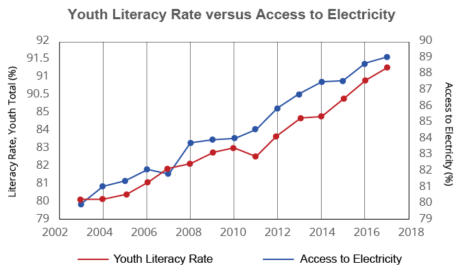
A graph with two y-axes using data from the table titled Youth Literacy Rate versus Access to Electricity. The x-axis is in years ranging from 2002 to 2018. One y-axis uses Youth Literacy Rate (%) data starting at 79 with a scale of 1 until 85, where the remaining values are 90.5, 91, 91.5 and 92. The second y-axis uses Access to Electricity data ranging from 79 to 91 with a uniform scale of 1.