Bachelor's Degrees Conferred by Race/Ethnicity
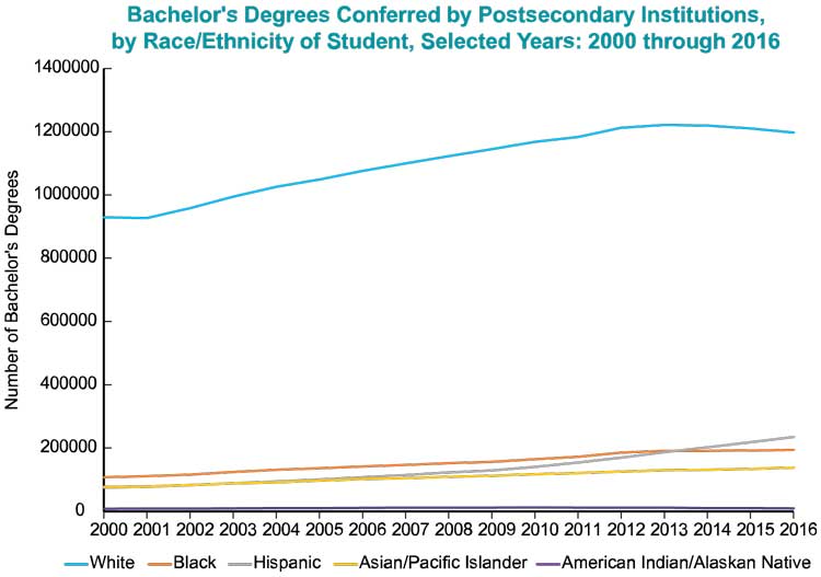
Review the following graph using data from IPEDS (Integrated Postsecondary Education Data) collected from Fall 2000 through Fall 2016 and answer the questions below.
| Year | White | Black | Hispanic | Asian/Pacific Islander | American Indian/Alaskan Native |
|---|---|---|---|---|---|
| 2000 | |||||
| 2001 | |||||
| 2002 | |||||
| 2003 | |||||
| 2004 | |||||
| 2005 | |||||
| 2006 | |||||
| 2007 | |||||
| 2008 | |||||
| 2009 | |||||
| 2010 | |||||
| 2011 | |||||
| 2012 | |||||
| 2013 | |||||
| 2014 | |||||
| 2015 | |||||
| 2016 |
Source: U.S. Department of Education, National Center for Education Statistics, Higher Education General Information Survey (HEGIS), "Degrees and Other Formal Awards Conferred" surveys, 1976-77 and 1980-81; Integrated Postsecondary Education Data System (IPEDS), "Completions Survey" (IPEDS-C:90-99); and IPEDS Fall 2000 through Fall 2016, Completions component. (This table was prepared August 2017).

A line graph of the data found in the table is titled "Bachelor's Degrees Conferred by Postsecondary Institutions, by Race/Ethnicity of Student, Selected Years: 2000 through 2016". The vertical axis is labeled "Number of Bachelor's Degrees" and ranges from to in increments of . The horizontal axis is labeled in years and ranges from 2000 to 2016 in increments of 1 year. There are lines plotted on the same graph for each category: White, Black, Hispanic, Asian/Pacific Islander, and American Indian/Alaskan Native. the general appearance of the lines is as follows:
-
The line for White starts at approximately in year 2000 and decreases slightly to approximately year 2001. from years 2001 to 2013 the line increases steadily to approximately . from years 2013 to 2016 the line decreases gradually to approximately .
-
The line for Black starts at approximately and gradually increases over the course of the graph ending at approximately at year 2016.
-
The line for Hispanic starts at approximately and gradually increases over the course of the graph ending at approximately at year 2016.
-
The line for Asian/Pacific Islander starts at approximately and gradually increases over the course of the graph ending at approximately at year 2016.
-
The line for American Indian/Alaskan Native starts at approximately and gradually increases until year 2010 at approximately . from years 2010 to 2016 the line gradually decreases to approximately .
-
Are the data displayed in the graph above discrete or continuous?
-
What is the level of measurement of the data?
-
Are the data above time series or cross-sectional data?
-
Examine the data for each race/ethnicity group. Do the data represent a stationary or nonstationary process? Explain your reasoning for each.
-
Do any of the race/ethnicity groups exhibit a decreasing trend? Try to think of some reasons why this is true.
-
Do any of the race/ethnicity groups show a strictly increasing trend over the entire time period from 2000 to 2016?