Why That Ad Caught Your Eye


Chapter 4: Sensation and Perception

Learning Outcomes

  • Analyze how abstract visual design elements (such as color, shape, and orientation) influence consumer perception and behavior through crossmodal correspondences
  • Evaluate the psychological impact of packaging design choices on consumer expectations, including perceived taste, quality, and healthiness
  • Apply principles of sensory and perceptual psychology to interpret how combinations of visual cues can communicate brand identity and product attributes

Key Terms

bottom-up processing
system in which perceptions are built from sensory input
pattern perception
ability to discriminate among different figures and shapes
perception
way that sensory information is interpreted and consciously experienced
perceptual hypothesis
educated guess used to interpret sensory information
top-down processing
interpretation of sensations is influenced by available knowledge, experiences, and thoughts

Thinking About Advertising

Lena, a psychology major interning at a food startup, was tasked with designing packaging for a new line of sparkling water. She thought it would be a simple design project until her supervisor handed her a research article and said, "Read this. It'll change how you think about color and shape."

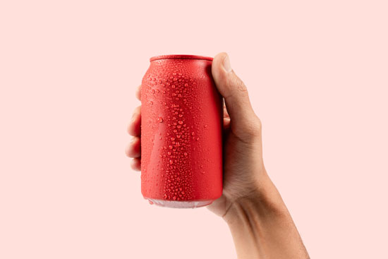
The article explained how consumers often associate colors and shapes with specific tastes and qualities. For example, red and round shapes are linked to sweetness, while angular shapes and dark colors suggest bitterness or strength. Even the orientation of stripes, such as vertical versus horizontal, can influence whether a product is perceived as luxurious or casual.

Lena decided to test this. She created two mock packages: one with vertical red-and-white stripes, another with horizontal blue-and-white stripes. She showed them to a focus group and asked what they expected the drink to taste like. The focus group's ability to distinguish between the two packaging designs relied on pattern perception, as they interpreted differences in color, shape, and stripe orientation to form expectations.

The results were striking. The red-striped version was seen as bold and intense; some even guessed it was spicy. The blue-striped version was described as refreshing, light, and "probably healthy." Their expectations about taste and quality were shaped by a perceptual hypothesis, as they made educated guesses based on visual cues without actually sampling the product.

Lena realized that packaging wasn't just about aesthetics; it was a form of psychological communication.

A picture of the tops of several colorful cans

1. On Your Own

Determine whether the following statement is true or false.

Lena's focus group expected the blue-and-white striped package to taste refreshing and light. This is an example of bottom-up processing, where prior knowledge and context shape perception.

Crossmodal Correspondences

The more Lena looked into it, the more she realized that the focus group's assumptions were based on the notion of crossmodal correspondences. Crossmodal correspondences are associations between different sensory modalities, like sight and taste. These associations can be learned (e.g., red = sweet) or may have evolutionary roots (e.g., angular shapes = danger).

An image of five red, heart-shaped lollipops arranged in alternating directions

Crossmodal correspondences are not random; they often reflect patterns learned through experience or shaped by evolutionary tendencies. For example, consumers may associate the color red with sweetness because of repeated exposure to red-colored candies and fruits like strawberries or cherries. These associations can become so ingrained that even without tasting a product, people form expectations based on its visual design.

In Lena's case, the red-and-white vertical stripes may have triggered associations with bold flavors or even fast-food branding, while the blue-and-white horizontal stripes evoked calmness and freshness, possibly linked to dairy or water products. Understanding these correspondences allows marketers as well as psychology students to predict how design choices influence perception and behavior, even before a product is opened.

2. On Your Own

Which psychological concept best explains why people associate certain colors or shapes with specific tastes? Select the best answer.

Explore the Concept

This video about packaging design and sales can help you learn more.

The Psychology of Packaging

Lena's experience designing packaging for sparkling water illustrates how deeply psychology is embedded in everyday decisions, both for consumers and marketers. Through her experiment, she discovered that visual design elements like color, shape, and orientation don't just make a product look appealing; they actively shape how people think it will taste, how healthy it seems, and even how much they're willing to pay.

A picture of a hand holding a red can

These effects are driven by crossmodal correspondences and top-down processing, where the brain uses visual cues to form expectations about other sensory experiences. As students of psychology, recognizing these subtle but powerful influences helps us understand how perception is constructed, how marketing leverages sensory cues, and how our brains constantly interpret the world through learned associations. In short, packaging is more than a container; it's a psychological message.

Reflect & Respond

Answer the following questions to reflect on key ideas from the case study. Remember to print your work before leaving this page!

  1. How did Lena's use of color and stripe orientation influence the focus group's expectations about the sparkling water? What does this suggest about the power of visual design in shaping perception?
  2. Can you think of a time when packaging influenced your expectations or experience of a product? What visual elements stood out to you?
  3. Why might certain color-taste associations (like red = sweet) be more common across cultures, while others vary?
  4. In what ways do top-down and bottom-up processing work together when we evaluate a product based on its packaging?
  5. If you were designing packaging for a healthy snack, what visual elements would you include to communicate healthiness? How would you avoid sending mixed messages?

References

The Packaging School. (2020, May 8). How package design affects sales [Video]. YouTube. https://www.youtube.com/watch?v=euacI5VTBhY

Spence, C., & Van Doorn, G. (2022). Visual communication via the design of food and beverage packaging. Cognitive Research: Principles and Implications, 7, Article 42. https://doi.org/10.1186/s41235-022-00391-9
This is an open-access article distributed under the terms of the Creative Commons Attribution 4.0 International License (CC-BY 4.0).

Photo Credits

Celso Pupo on Adobe Stock. "Cans of soft drink."

dzevoniia on Adobe Stock. "Five red sweet tasty lollipops in shape of heart."

TropicalNinjaStudio on Adobe Stock. "Male hand holding a red aluminium drinking soda can mockup isolated on pink background."